Showing posts with label Marisha Aya. Show all posts

Monday, 29 April 2013

Marisha Aya -week 6 - final!!

Heyhey!!!
So here is the final post for this project! hope you guys liked the development over time, the thoughts, the ideas and the understanding that have/has become part of the process to reach this final stage!!


model 1 fig. 1

model 1 fig. 2
model 1 fig.3

From my previous work, I decided to use my wooden model as a means to help direct the shapes, the forms, the 'mass', the 'solids' and the 'voids' in my final model. However, as I completed this model, I started realising that the space was too 'DEFINED'. The model ended up actually looking like a structure, the materials informing the directly obvious associations; the cardboard planes being the walls, the wooden platforms looked very much like decking and the acetate clearly being a window. I understood then, that I had moved away from the focus and the whole point of the task in the first place.

In order to figure out where I had gone wrong on the first place, I traced back to the origin of the task; to create a 'space' which could be 'occupied'. My interpretation of the word 'occupied' is where I went wrong. During the initial stages of making the final model, my first thought in relation to create a space which could be 'occupied' was some form of a shelter, something that protects from the exterior, which then immediately flicked to a building, because well, that's architecture right??

I talked to a few of the tutors about this (and I mentioned this in my critique too) that I was led out to the stairs outside our studio, (the ones that lead down to the main car-park) and asked whether I was occupying the space (yes) and whether the stairs were sheltered in anyway (no). It was then that I actually understood...

A space need not be defined in anyway for it to be occupied or used. Furthermore, our interpretations o the word 'occupy' are often misled, (it was in my case anyway!) and has more than just one way of looking at it. 

Keeping all this in mind, I created a new model, that made the best use of my new-found understanding.


model 2 Fig. 1

Model 2 Fig. 2

Model 2. Fig 3

I still wanted to make the best use of the idea of 'exposure' and 'enclosure' I had designed in the previous week, so I created a series of spaces that segregated one from another. The images above clearly illustrate that. The upside down pyramid is my 'solid' and was used as a means to heighten the 'enclosed' aspect of the site positioning alongside the natural enclosure the cave provides. Also, the contrasting plane (the only one that is not black) adds to this segregation; doing so by cutting off the occupants view from the 'inside' to the 'outside' save for the little opening that allows the flow from one space to the other.

What I aimed to achieve was not only the segregation of the two, but moreover the DRAMATIC change from one (enclosed) to the other (exposed) in a very short space/ period of space. This can be understood by comparing how much of the model is part of the enclosed to the amount of space allocated to the exposed. I found this play of spaced and the change from one to another very interesting and wanted to understand what could be created if this play was pulled to extremity, which my model tries to achieve!

However, even though I thought I had moved on from the 'defining' aspect, one thing still creeped into my new model, the thing being the rectangular opening, which is instantly identified as a door! (LOL, it's funny to see how our conceptions of architecture as so engrained into our subconscious!) But I have changed that and a few other things! will load pictures up of the final final as soon as I can!

I would love to hear any ideas or added thoughts/comments from you guys! 

See you all tomorrow!
-Marisha


Monday, 8 April 2013

Marisha Aya- week 5, explorations and contour model =D

Im catching up! yay!

My final contour model was altered a tad to meet the minimum height requirements, also to enhance the final model further I interpreted my contour lines a little differently to create the cave that can be seen in the image below. By doing this, we already establish a NATURAL enclosure within the site.
Final Contour Model 
To start the process of exploration, I selected a sample of three spaces that were visually prominent and used them as a basis of my experiments with the different model.

Deep Valley

Cave

A play of varying depths and surface area that visually creates a very interesting space in-itself
During the main studio briefing, we were asked to play and tamper around with the idea of SOLID and MASS and use them to recreate space. As usual, I was very confused as to how to actually create space with a SOLID object, something that is devoid of all sense of space itself.  It took me a while to understand that just like the solid concrete walls of a building or room generate the sense of 'space' within that room or just like solid wooden planks combine to create the space within the box, so too, could the solid form interact with the surface of the contour model to create space.

(Since I am only at the exploratory stage, I have not manipulated any of the models just yet, using the originals to understand how the materials and the models would relate to the contour context to create the sense of enclosure)


Even though I was able to, in the end, create that idea of enclose space with the primitive solid, it was still felt very rigid, and after talking to the tutors that using the models (wood, paper and wire) as a starting point would not be a bad idea either considering that they were 'born' from the primitive shape anyway and still had the essence of the original shape as is. 


The upturned plane starts creating something of a viewing platform to the deep valley below. 
It is interesting to see how the model relates to the naturally enclosed space. We can start to see the different 'spaces' created within the very same 'space'; the idea of 'enclosure' is enhanced by the deep, comforting and dark area inside the cave. However, the orientation is very awkward!


I also used the wooden model as a means of exploration.

The placement of the model creates a very 'tent-like' space in that hollow triangular area generated through the interaction of the model and the flat surface. 

'overhanging' - we can start to imagine the thrill one would feel walking along that overhanging ledge or just sitting on it looking down at the deep valley below. 
 Stemmed from the idea of overhanging came this positioning of the model hung over the caves edge, half in and half out! (Tripppyyyy!)

The interaction between the spaces within the model and the natural space suggested by the contour model very effective where each space, in relation to the contour model, has a different 'feel'. For example in the images below, we see the lower right hand side platform of the model jut into the natural enclosed space created by the cave, bringing with a sense of safety and cosy-ness as it faces a very shallow space in comparison to the upper left hand-side platforms that protrudes into the wide open space. This side, like the 'overhanging ledge' brings a sense of thrill and excitement as it overlooks the landscape and the valley from a height. The floating quality of the positioning alongside the model's interaction with the surrounding space and the contours is what make this position quite successful.

When developed further with careful consideration of placement and keeping in mind the aim of the task, to create an enclosure and think about how the spaces created would be 'occupied',  I think the final might just be very interesting! Can't wait to see what happens!!!


 I would LOVE some feedback as to what you reckon about the positioning of the models and what I can do to make it more effective!

-Marisha Aya

Marisha Aya - week four

Heya guys! sorry for the late post for week three studio work :/ had a few issues with the laptop but it's up and running again!

Below are two images from the weeks charette activity, the second one being the one I edited slightly after a bit of discussion with Marie, about how even the smallest of additions to a drawing can bring it to life.

Just a heads up, the image is sort of divided vertically through the middle of the page (imagine an imaginary line) where on one side, the side with the cube, has been rendered naturally, with the shadows being the darkest and the areas where the light hits the surface being the lightest. However, on the pyramid side of the page, this normality has been reversed, so the place where the shadows were cast appear to be the lightest areas. Sorry for the confusion, I just wanted to experiment with this contrast, and looking at the two images, a very uncomfortable vibe is created, particularly when the eye travels to the junction of the pyramid and the cube and focuses on the contrast of the shadow cast on the cube by the pyramid and the natural shadow of the pyramid itself. 


 As can be seen, where the pyramid ends and where the cube begins is hard to distinguished, so, I added a little more shadow to the cube where it intersects with the edge of the pyramid, using the contrast as a means to bring the pyramid 'further out' visually.


I have also attached the section drawings that I have completed so far. I found these drawings to be very challenging and time consuming in particular, perhaps because of the precision and accuracy required for them; something we have not practised over the previous weeks. However, I do think it was a good activity for us in terms of actually learning how the space is segregated within the model itself and how all these individual 'slices' forms the final model in the end when layered one upon another (refer to last image).


paper model sectional


wooden model sectional


Compilation and layering of the wooden model sectionals to visually understand how each section related to the other and how they all 'fit' to become one unit.


Let me know what you think =)


Wednesday, 20 March 2013

Marisha Aya- negotiating the void (updated)

Hey Hey!!!

Sorry for the late timings but it is the best I could do :(

So today we were asked to create three different models using mainly popsicle sticks, each representing one of the three characteristics; symmetry, asymmetry and balance.

I started working with the symmetry model to begin with. However, I found that I struggled to generate ideas of symmetry without obtaining a very 'rigid' and 'tense' product at the end. This can be seen very easily in the picture above where in order to present symmetry, my model ended up looking dull, and almost autonomous! Could definitely be improved to create something more visually interesting!

Symmetry

asymmetry angle 1

asymmetry angle 2

Working with the asymmetry model was far more interesting in my opinion as I felt 'freer' (if thats a word!) to play around and not worry about attaining the perfect rigidity required to create symmetry. For my model, I chose to play around with the focal junctions as a characteristic that also contributes towards the overall asymmetry of the piece. This can be seen through the fact that there are two junctions/joints lying on the same axis (refer to angle 2) where aluminium wire has been used to hold the sticks in place whereas the rest are simply joint manually. This results in the eye travelling along that axis and pausing at the main wire junction before moving to the rest of the model, thus skewing the visual balance and symmetry alongside the asymmetry created through the form itself.
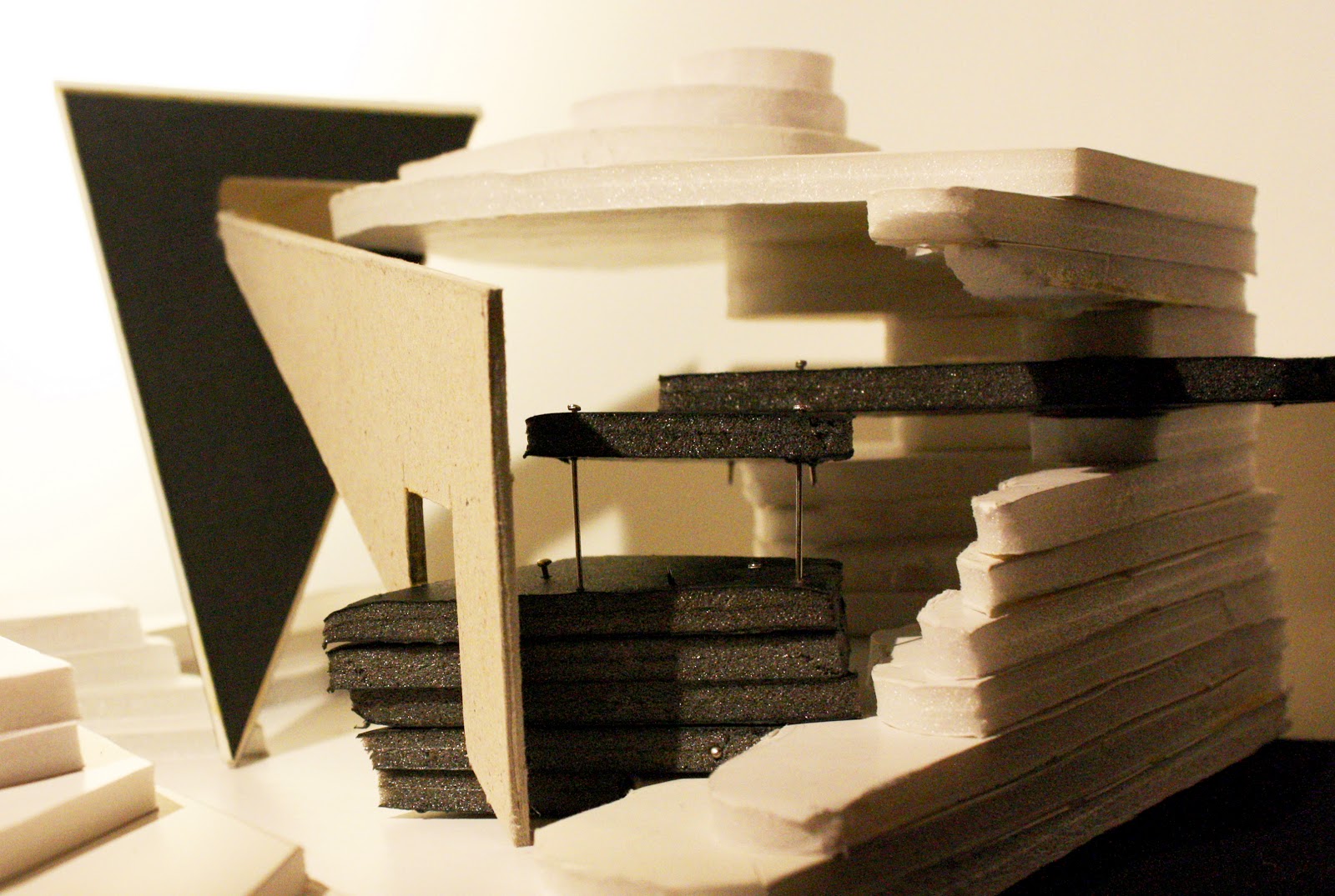


Balance

The last piece had to represent balance. Instead of focusing on visual balance, I chose to focus on the illusion of balance, where as seen in the image above, where the small vertical stick (top right) appears to be 'balancing'/hanging off the sloping stick almost perpendicular to it. Notice how the joints affect this illusion too, where all the sticks in the model are joint using wire except for the joint where the vertical stick intersects with the sloping stick to the left. This was done deliberately to try and communicate this idea of it looking like its not actually joint to the piece and is simply balanced from it rather than fixed and held down using the wire like in all the other joints in the piece.

Visual balance is also lightly suggested as the horizontal plane of the model, (the sticks in the bottom half) looks like a mirroring of the vertical plane (the sticks in the top half), however, this was not the focus of the piece!


Showcased below are my finals from the series of models created to experiment and explore the idea of space.


Right from the beginning of the task I was very confused as to whether the space inside our acetate shape needed to be FILLED or FORMED. I.e Is the space supposed to be filled up or formed deliberately. When this question was asked to a set of the tutors, all of them said that the best solution would be to just try it out, experiment and then you will come to know.

So starting with the paper model, I made one to fill the empty space, using the exterior contours on the acetate as a guide to do so...

Paper-planar-'Fill the space'
And a model which 'formed' the space....

Paper- planar- 'Form the space'
Both produced varying results. Visually, the 'fill' model looked so much more interesting with it's multiple faces jutting out edgily in spontaneous directions. In comparison the the 'form' model, it seemed almost more exhilarating! 

However, the point of the task was to use the material as a means to 'create' the space within. Looking from this point of view, the 'fill' model started looking messy to me, it lacked a dominance of SPACE itself and appeared haphazard as if the material defined the space instead of space defining the material. 

In comparison, the second 'form' model appears more CONTROLLED and deliberate, where the space holds a dominance over the material. And when taken further, we can also see that the model shows a dominance in the distribution of space within the model too, the dominant space being the void formed in the centre of model two which separates into smaller confines as it moves out from the heart. As a result I understood that the whole point of the experiment was to use our materials to not 'fill' but 'form' and define the unknown space within. 

Using the same concept, I created my wooden and wire models. 


Wooden - linear
I used the wood as a means to visually suggest the boundaries of the platonic shape of the acetate (octahedron in my case) rather than actually physically make the boundary. The criss-crossing strips of wood moving off in different directions, alongside their angled ends was my method of doing so.

Wire - curvi linear

In my opinion, my wood and wire models were far less successful at communicating the idea of space and forming it. Perhaps because Planes, with their solid surfaces are able to define and break up space a lot more effectively than hard lines that the wood and the wire possess, resulting in us being able to only suggest space instead of actually defining the space which the paper allowed us to do so freely. 


That's all! Let me know what you think!


Friday, 15 March 2013

Marisha Aya Rorschach- week 2

Heya guys!

So here is my upload of all the things I have done and learnt over week 2 of this project and this entry of my blog will sort of be a reflection so hope you don't mind the length :)

Dominant


Balance
The two images above are from the charette we did early this week where one had to communicate the idea of dominance and the other of balance.

Through this activity, I wanted to explore whether it was necessary to have more of one than the other to create dominance and this can be clearly seen in the first image where even though the central dark form is 'smaller' and takes up less space than the surrounding negative white space, it is still the 'dominant' image. I understood that this works in reversal too, where even if the whole page was filled up with black, a small section of white would 'dominate' the final image. However, I am still very confused about what, in the case above, would be the 'positive' space and what would be the 'negative' space.

I tried to explore a similar concept in the 'balance' charette (bottom pic), however the question this time was whether you need 'equality' to create a sense of balance. Even though I did not complete this charette I was still able to answer my question through the activity by not only looking at my own image but that of others too. I found that a small dark space visually balance a larger white space.

Perhaps it is the illusion of depth naturally created via shading or filling in a form with black that balances out the large flat space of just negative white on the paper?
Even though its not clear we can kind-of see the evidence of this unequal balance in the image above.

charette- background, mid ground, fore-ground.


The series of images above are a selection from my primitive contour drafts. Initially, I found it quite hard to pick out the prominent geometric shapes in a drawing full of random curve and squiggles. And the drafts seen above are quite condensed and filtered down to just the basics which is evident when compared to my final contour drawing from last week.

The series shows a development of arrangement of shapes where I tried to create a striking contrast between the sharp hard lines and the softer curves of the circles I'm not sure whether the dominant angular lines take the focus away from the circular forms or whether they should be the focus to begin with. Any suggestions would be much appreciated!


final primitive contour

Trial 3D shapes


This is my final 3D platonic shape I chose to work with which is an Octahedron. The shape allows for a greater number of vertex's which create a very angular look which I thought would compliment my primitive contour which is also full of very sharp angles when used to recreate this form on acetate.

A few trials of using my primitive contour to recreate the octahedron to establish which net system would work the best. 


This is another trial of using my primitive to recreate the 3D form but in this draft I wanted to add a fourth dimension (if you could call it that!) to the model. To do so I added a square piece (a part of my primitive) INSIDE the shape along the horizontal axis, so essentially it becomes two pyramids joint along the square face of each. (it is not very clear in the image, I'm sorry about that) I did this as I thought it would be very effective considering that the overall form itself was transparent, and by adding that horizontal plane INSIDE the shape would create a greater sense of depth where the observer would see contour lines INSIDE the form too, not just on the surface, but it was not very successful as it just ended up looking very muddled and confusing. :( But definitely worth a try!

Seen below is my final primitive-contour-3D form!


Sweet! Thanks guys! Please let me know what you think about the whole depth thing =)
-Marisha Aya