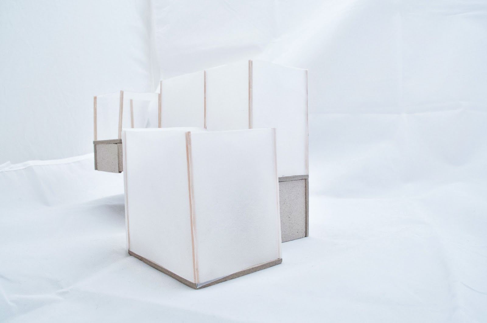
This is the base of my hermitage. It is also the first concept of of the hermitage.
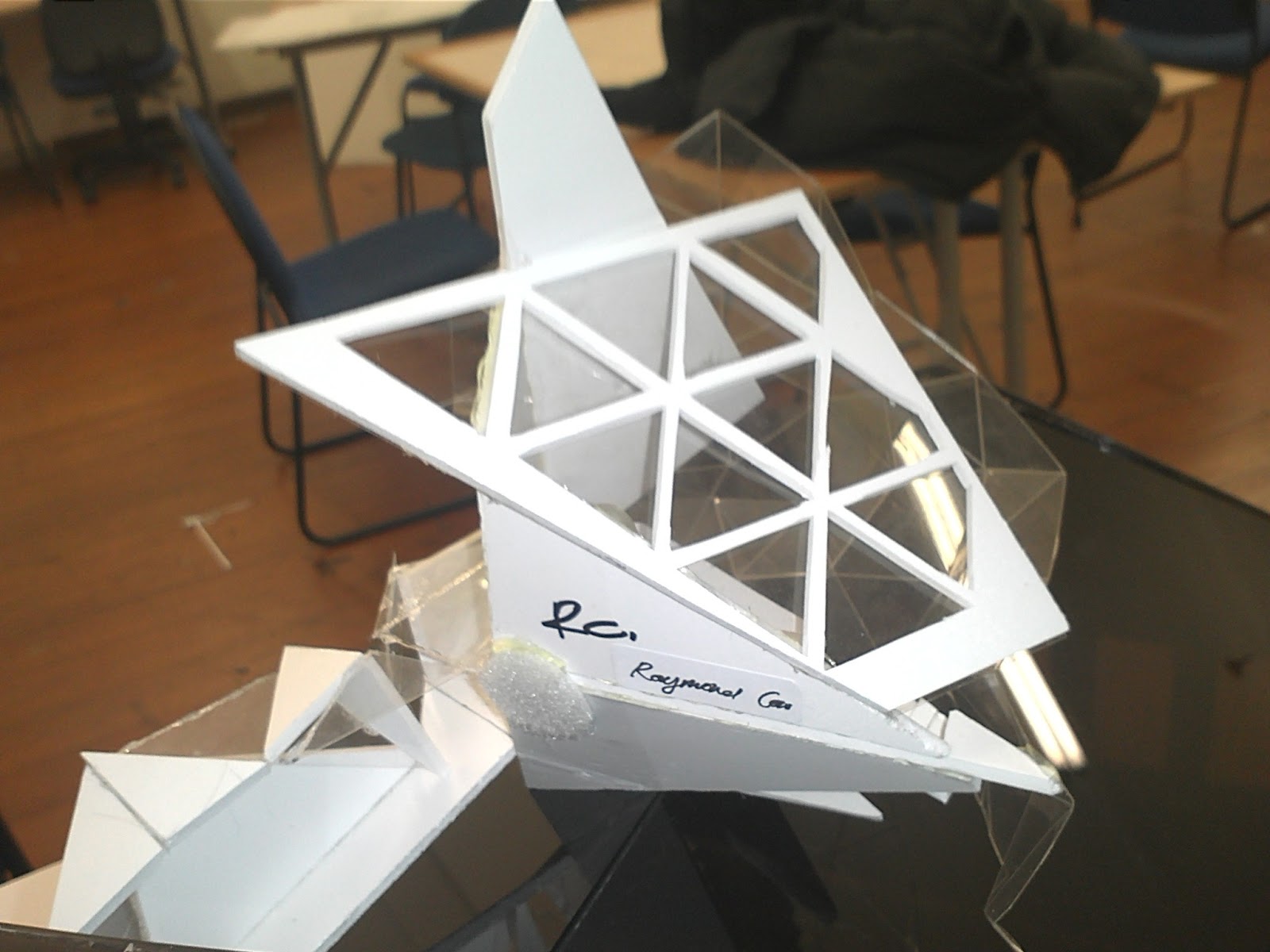
Recombination: Final.

The idea of this first concept came from the final recombination. The idea came from the form. the form of the recombination have an appearance of an object in flight.
The layout/ placement of mass meant that there was little in a sense of closure - it is every open. The defined space are difficult to identify.
Having this theme in mind i went back and researched words to describe flight and its association to human emotions.

These are the words i think explains the inspiration in creating this concept: peace, freedom, free, exposure, soar, float, exploration, open and adventure.
This is the result. The concept is very "modernist" in form. the whole herminate is made up of 3 cube/ rectangular shapes. it is very exposed/ open as all of the walls and roof is glazed.
Before having this idea i was quite interested in exploring the use of switchable glass. What it is basically is glass that has the ability to become opaque when electric current runs through it.

you can find out more here and here.
Making it exposed, I believe enforces the idea of one person experience of freedom, exposure and openness. It also challenges a person sense adventure and exploration
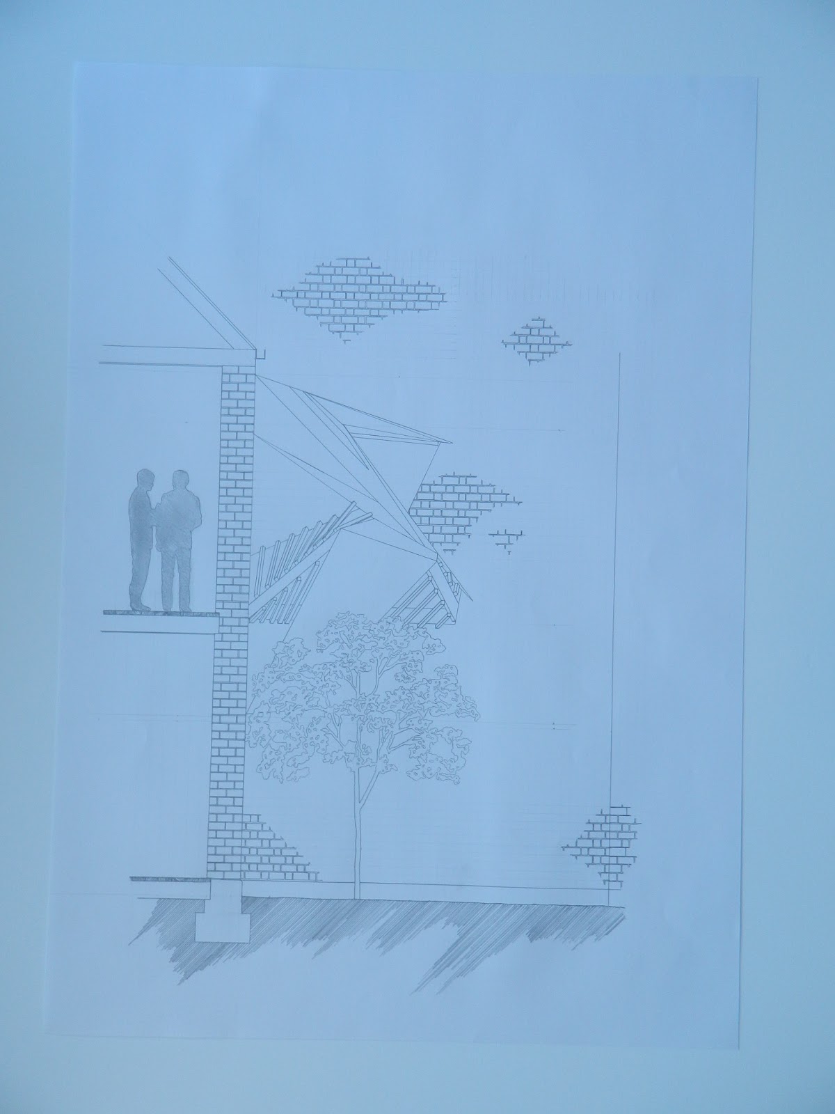
The location also enforces my idea. it is on the roof, it creates an experience of height, and exposure.
comment below :)


