Project 1, Week 5 - Mass + Void + Site
Here is my finished Site. It has taken a long time to develop but it is now complete. Because my original Klecky is so symmetrical i have used to the contours to create some asymmetry to make it look more like a realistic site as no are would have perfect symmetry. I did this by creating varying degrees of height and slope on each side of my site.
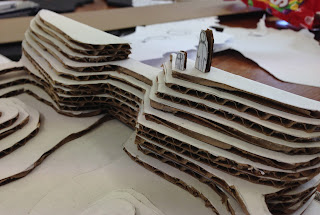
I built the site from the bottom up to create the varying contours and heights. I found this to be the easiest way to do it as it also made it easier to plan.
Next I am going to work on developing my models to create a space in which would form a function for a person/ people. My ideas at the moment are to utilise the highest point as it would create the best view of the rest of the site. I also wan to try designing the model in 1:100 Scale and 1:200 to see what fits best.
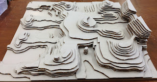


With my site I look at it as an expanse of land that breaks off a main land. The model is mainly surrounded by low level areas either at or just above sea level at its lowest point. Because of this I see in my model that people would come from the highest point and would have to climb down and around to navigate the landscape.
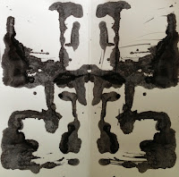
Here is my original klecky compared to my contour model to see the inspiration used to create this site and how the two have developed.
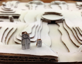 |
1:200 & 1:100 Scale From highest point.
Site could be represented as a valley in the background |
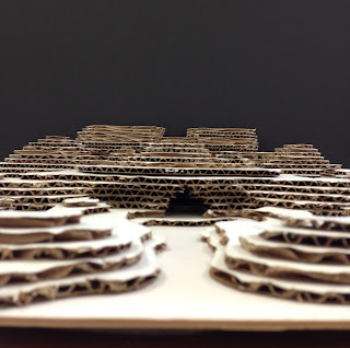 |
| Representation of a cave can be seen here. |
 |
This could be a waterfall flowing into a valley.
Also 1:200 and 1:100 scale people to represent size and scale.
These photos show my attempts at trying to create a space using the shapes my original primitive model created.
I started trying to work with my scale at 1:100 and was unsuccessful.
I noticed the scale of my model compared to the site was too big and looked
very un-natural, even though the scale person fit.
I have created many variations of my model to create a space in which a person could occupy. I started by making the general shapes found in my primitive and assembled them together within my landscape. i tried create spaces within the model as well as using the relationship between the model and the site to create other varying spaces. All models are at 1:200 scale.
This is my final Site + Void model. I aimed to create the various shapes inspired from my paper model and arrange them in such a way that it can work work with and create various space. My Aim was to make it a habitable space for someone not only as a kind of shelter but also to improve accessibility around the site.
I placed my model near the highest point as to utilise the view of the site. The model consists of multiple layers which I thought helped the void + site come together. When placing the model on the site I wanted to do it in such a way that the model used the site to create various internal and external space. The thickness of the material was made to give the perception of a strong thick safe internal space, however i kept everything open as to not give a trapped enclosed feeling.
This is my final model. I have made my contour model again with foam board as it made my model much cleaner and crisp, as the cardboard was hard to cut smooth.
I have also made my void model again using wood this time. Wood was a much better material to use for my specific model. It was easier to get the shapes i wanted and i could sand it all down smooth making it look much neater. However I painted my model grey. I wanted it to be a neutral colour as I did not want to wooden grain to be seen. If i showed the wood grain my model would automatically be conceptualised as a wooden structure rather than looking at the actual object. I did not want it to be a distraction.
|

 Here is my original klecky compared to my contour model to see the inspiration used to create this site and how the two have developed.
 Here is my original klecky compared to my contour model to see the inspiration used to create this site and how the two have developed.


You're alright, Matey. 1:100 makes your waterfall look like a piddly weir. Go for Grand, I'd say: You live in the land of Milford Sound, don't forget.
ReplyDeleteClear presentation of your process and thinking,as discussed yesterday,the choice of the scale is capital for this project and with the kind of space you would like to create, you need a strong, deep landscape.
ReplyDelete